Indonet Brand Center
The trusted hub for Indonet’s official brand assets and guidelines.
informationWelcome to Indonet Brand Center
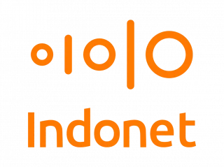

Our Logo
Our logo is an intrinsic part of our brand story and reflects three interconnected themes:
- The vertical lines and circles represent binary code and the world of connectivity, data and technology.
- The arrangement of the lines and circles forms a cloud shape to represent cloud computing.
- Most importantly, the increasing size of the lines and circles, from left to right, represents both the flow of data from west to east as Asian territories grow in scale and importance, and the movement of data closer to the edge and to the end-user, enhancing speed, security and the user experience.
Indonet proudly reinforces its identity as an integral part of Digital Edge. More than just a visual change, the logo symbolizes Indonet’s alignment with a broader regional vision, reflecting its commitment to innovation, agility, and delivering next-generation digital infrastructure.
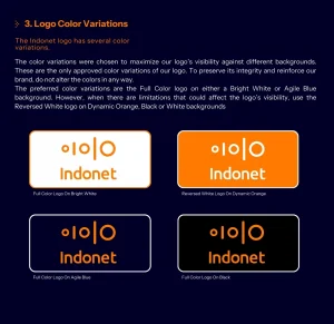
Indonet logo has several color variations.
The color variations were chosen to maximize our logo’s visibility against different backgrounds. These are the only approved color variations of our logo. To preserve its integrity and reinforce our brand, do not alter the colors in any way.
The preferred color variations are the Full Color logo on either a Bright White or Agile Blue background. However, when there are limitations that could affect the logo’s visibility, use the Reversed White logo on Dynamic Orange, Black or White backgrounds


Brand GuidelinesAll You Need to Know about Indonet Brand Guidelines
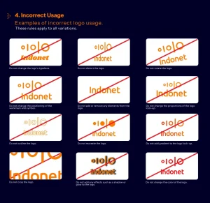
Examples of incorrect logo usage:
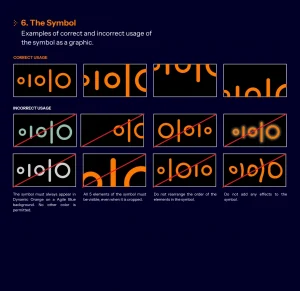
Examples of correct and incorrect usage of the symbol as a graphic:
To illustrate our collaboration, we have created a visual representation using a line. This is a simple and effective visual co-branding lockup to represent our collaborative relationship. The lockup is established using the size of the ‘logo mark’ with 1pt line thickness in the color #1D2129.

